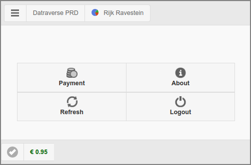
The main page is restricted to just a button
with a selection of generic options as present in the User Web App. The button opens
the Payment dialog.
A button that opens a custom URL in a new tab is shown
instead of the button, if the URL is set with
configuration property "webapp.payment.help.url" and enabled with
"webapp.payment.help.url.enable" default value
Y (disable with value N ).
By default, button text on mobile devices only: on desktops a hover text is shown.
You can change this behavior by setting configuration property
webapp.payment.main.nav-button-text to value ON
(button text is always shown), OFF (button text is never shown) or
AUTO (button text is shown on mobile devices only).
See Section 4.11.15, “Config Editor” on how to change configuration properties.
If PaperCut Personal User Account is enabled, the account balance in the footer is prefixed with the PaperCut icon.
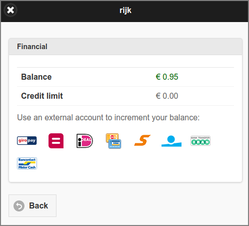
This dialog is a restricted version of Section 3.10.5, “Financial”. Just the external
accounts to increment user balance are shown. If PaperCut Personal User
Account is enabled, the Balance label is
prefixed with the PaperCut icon and Credit limit is
not shown.